Today I just want speak about "Context"... about "Systemic analysis"
The Story
In #softwaredesign it is the same thing, you can have the same feature with subtle different uses depend of the page you come from or the parameters you have already given.
#UX Designer is like a detective who is able to see invisible cues in order to identify those subtle different use…you have to listen to behavior…you have to see the invisible…you have to touch the untouchable…you want to create interface so perfect that the user forgets it…
You have to analyse the tools in environments for users you have to conduct a Systems analysis
The Problem
Today, I used the “message” feature of
@Linkedin…ok not only today…
I want to write with one of my contact, so I search him in my contacts page ok…done ! check pointI tap on the thumbnail photo of those contact ok…done ! check pointAnd I have a BIG button “Message” a #CTA (Call To Action) !! Wonderfull @Linkedin helps me to write to my contacts…so Action !!…I tap on “Message” and @Linkedin opens the messages page with the name of my contact awesome..
 |
| Linked Contact Detail Page & CTA |
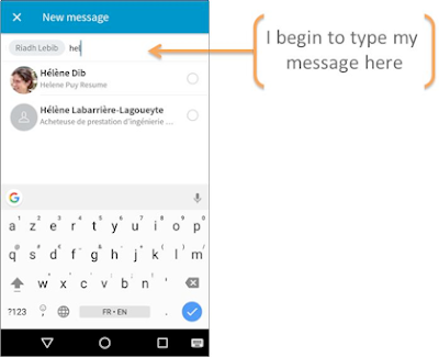
So I begin to write…
hmmmmm… ????
When I write it displays me other contact hmmm???
But I have already choose my contact…
 |
| Linkedin first time message for a contact |
 |
| Linkedin first time message for a contact sent |
Hmm Hmmm??? Grrrrr !!!!
The message has been deleted and now I am in another area…grrr !!!!
My point of view
The topic is the same with my car…I can’t study my car only in its all detached from all environment, detached from all context, detached from all uses… a car is used in several environments, in several context, with different type of users…For a feature it is the same thing !! Think #Personna, Think #Userflow, Think #UserJourneyMap…ok lots of Hashtag for further post JSo, When the user arrives on the “message page” he/she can arrive from different pages, with different context, and different profil, here the contexts can be:- Case 1 : The user arrives from the “Message” button on a contact detail page for the FIRST Time (It is my case in this post !!)
- Case 2 : The user arrives from the “Message” button on a contact detail page after the first time
- Case 3 : The user arrives from the Message tab menu
In the case 1, @Linkedin, today let the cursor in “Contact” area to let the users adding new contact. I repeat, the user clic on the “Message button” displays on the detail page of a contact, so we can be 99% sure he/she wants to write to this contact, perhaps, he/she wants to add another contact…perhaps…I don’t want to say that user never wants to add contact in their message. Nevertheless is it a #RedAxe at this moment of the story ? Probably 99% of people just want to write their message only to the current contact like they type an SMS…So @Linkedin, why you let the cursor in the contact area, and ask your users to systematically tap on “Type a Message” area before typing their message.Don’t forget if you ask a user to do 99% of the time a action when they just arrive on a screen like changing the focus of the interactive objet, answering a question in a pop-up, resizing a window, closing a pop-up, probably surely you have forgotten something during the analysis step of the feature…
My proposal
Your job as #UXDesigner is to create positive emotion during the use of a product or a service, and so strange it can appear, it is by reducing interaction with you tool you will have a better #UXDesign.I want to add that, in this case, another issue of my misunderstanding is the lack of visual indicator like #Affordance to help the user to know where he/she is and what can he/she does here. With a good use of #MaterialDesign you can help your user to understand he is not in the good place.
Don’t forget
It is by making forget your interface
that
your users remember it.
Pierre Lebailly - UX Designer
that
your users remember it.
Pierre Lebailly - UX Designer


Commentaires
Enregistrer un commentaire